Project title:
SPK
Creation of a Surf, Paddle and Kayak Company
Design and development of SPK, a conceptual company specializing in paddle, kayak and surfing equipment.
- Brand creation
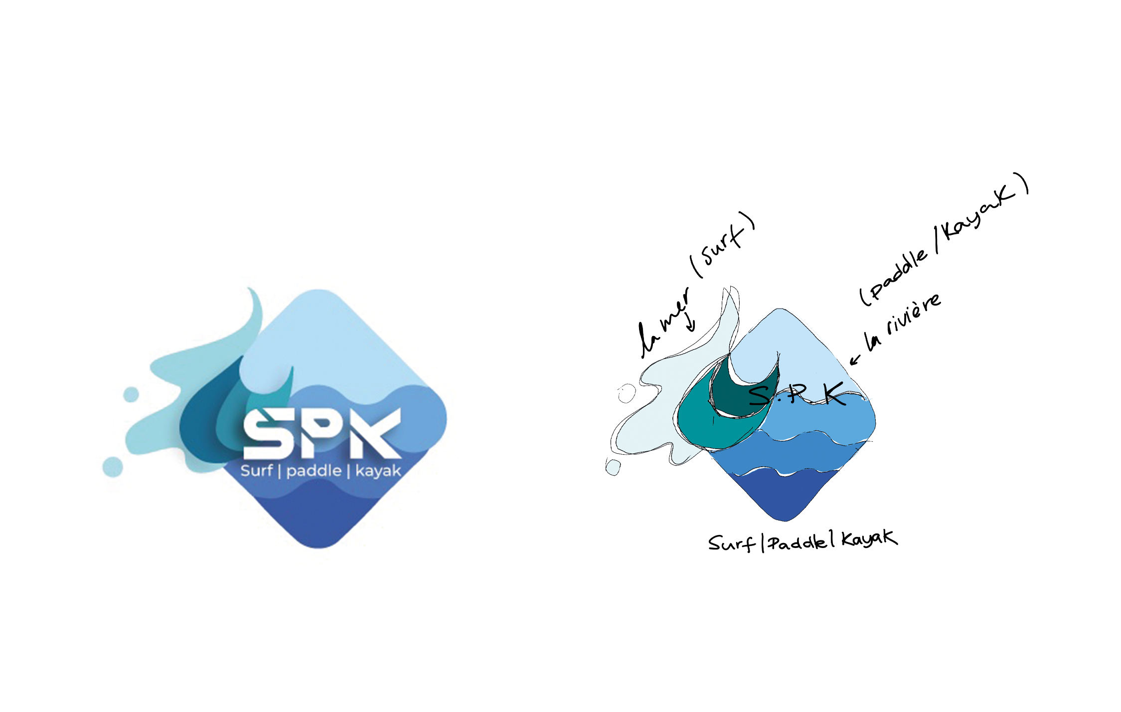
- Logo design
- Graphic rules
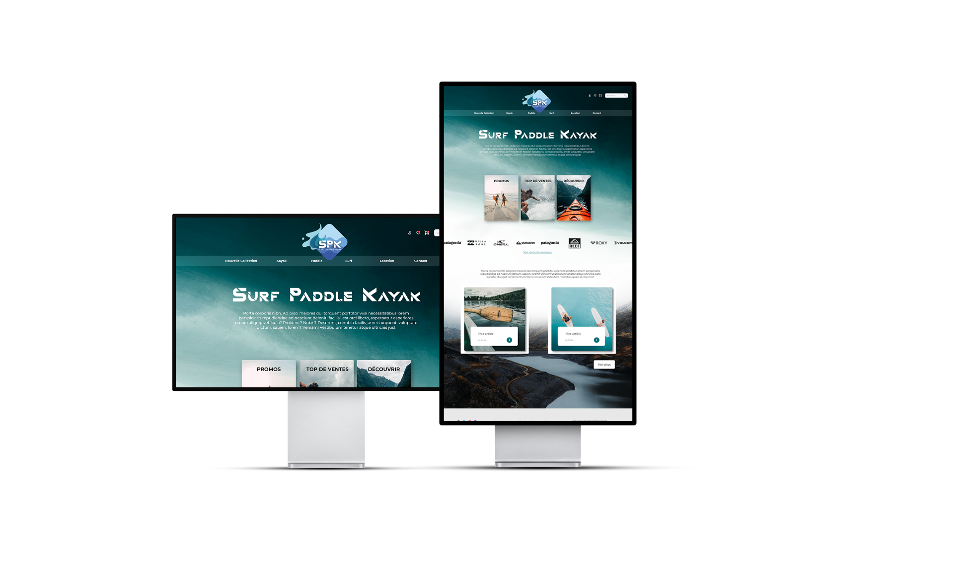
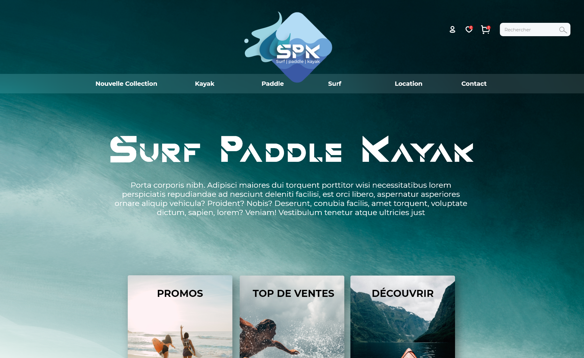
- Wireframe and website prototyping.
Objectives :
As part of a collaborative class project, the objective was to imagine a complete company in a theme assigned to chance (water sports) and to create its visual and digital identity.
The deliverables included a logo, graphic charter rules, as well as a prototype of website or mobile application compliant with the specifications.
Challenges and Solutions :
One of the main challenges was to design a brand identity that harmoniously unifies the three sports while allowing SPK to stand out in the competitive water sports market.
This was achieved thanks to a strong and consistent visual identity, highlighting the key values of SPK.
Main features:
- A unique and consistent brand identity.
- A website prototype with an engaging user interface adapted to SPK offers.
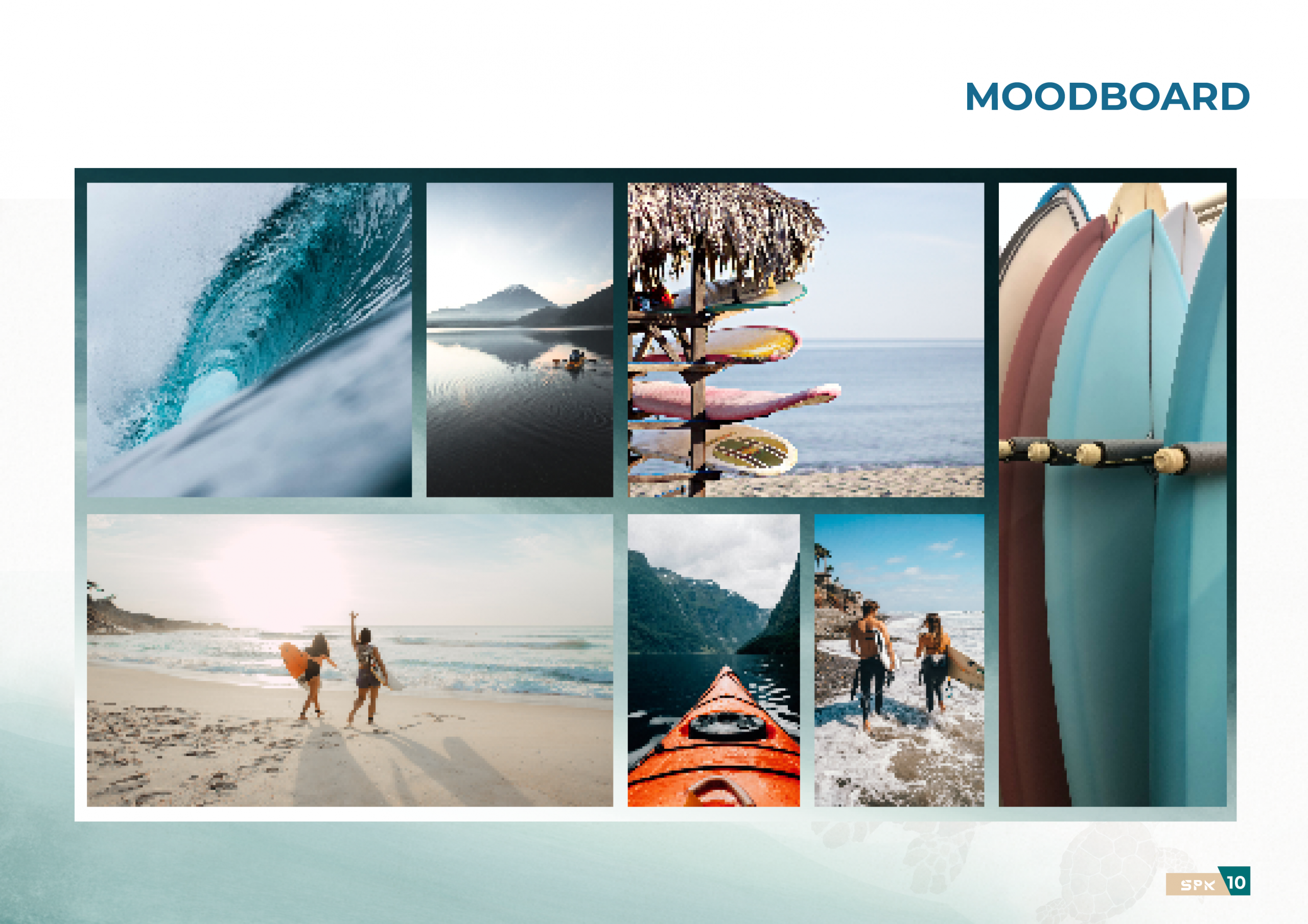
- Visual elements inspired by natural aquatic environments